
UI Feedback/Suggestions
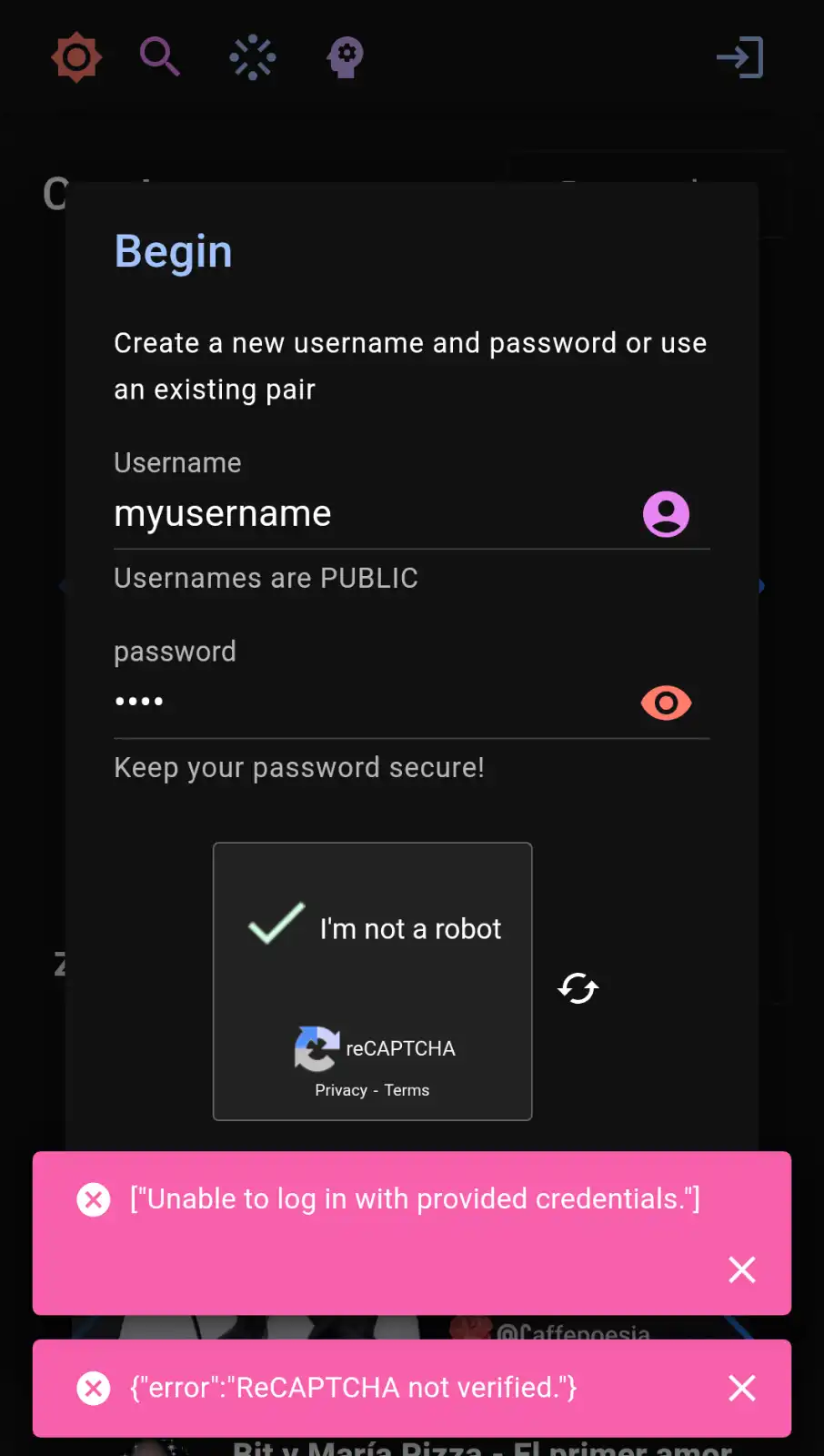
Login UI
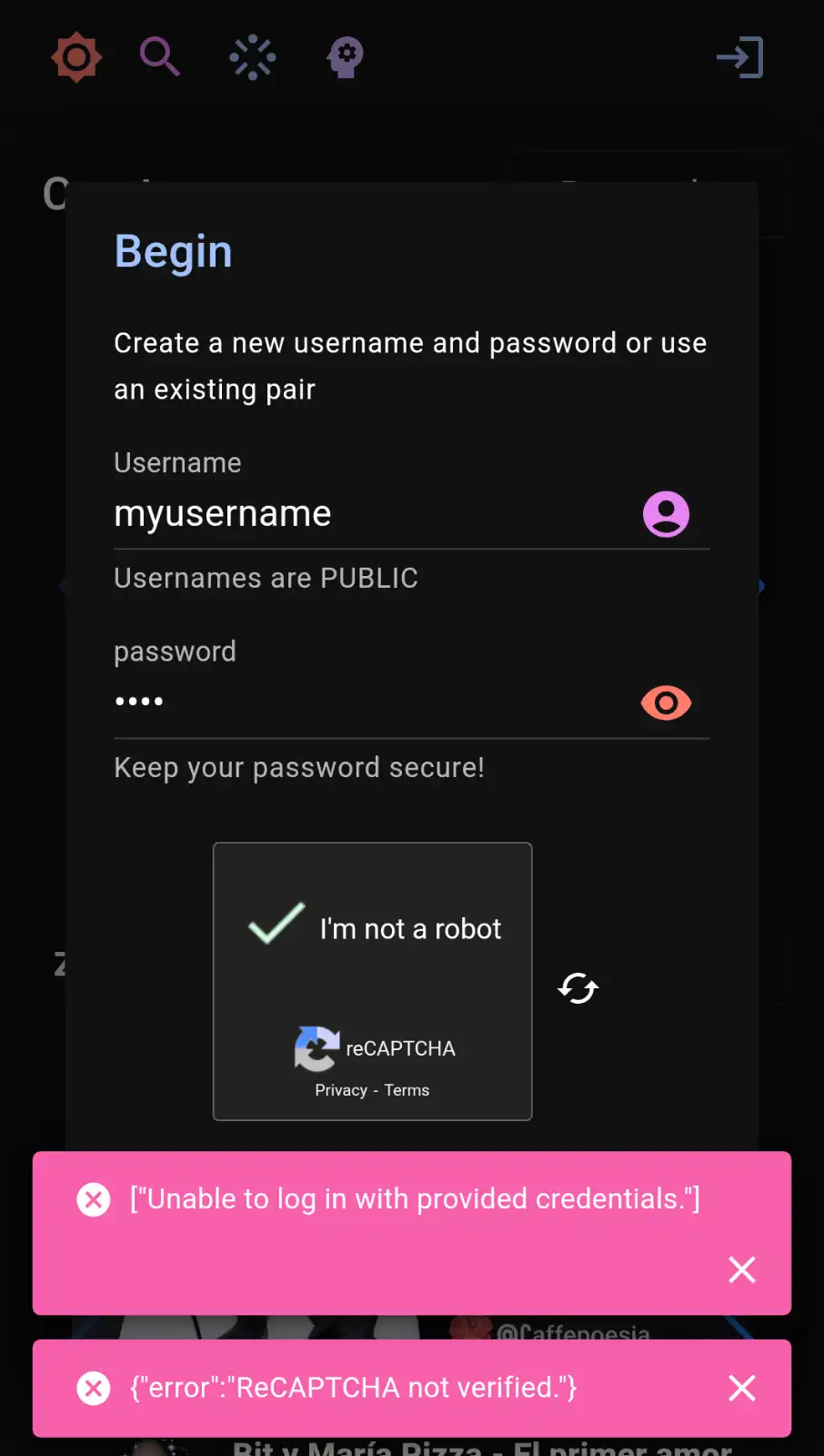
- Move error handling to input components
- Use Formik for client-side validation
- Separate out login/signup
- Move login/signup to different route, or hide the background to stop it from distracting the user.
- Optional email field – for recovery, e.g.
Email (optional)
- Better mobile UI/UX
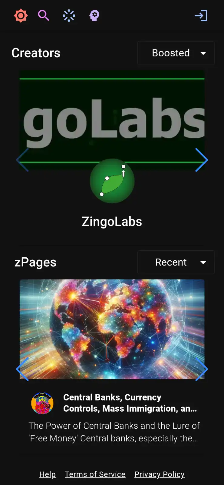
- Make it clearer that you can swipe or press right/left arrows (make them bolder maybe), or offer alternative pagination method
- Fluff out homepage, more info/data
- Mix different creator/post types. Boosted first, then recent, same with posts. Maybe 4x4 grid on mobile incase a user isn't very familiar with the touch swipe pattern.

- Move avatar/banner to their respective locations, with a pencil/edit icon. Common pattern on platforms like Instagram/Twitter.
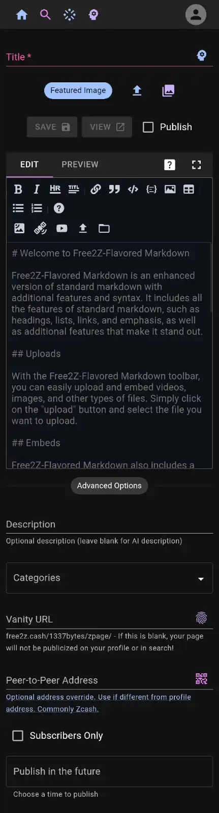
- WYSIWYG, add toggle dropdown button for less used icon buttons.
- Clean up UI
- The four icons in the top are a bit unclear, need to guess/tap them to see what they do.
- UI improvements
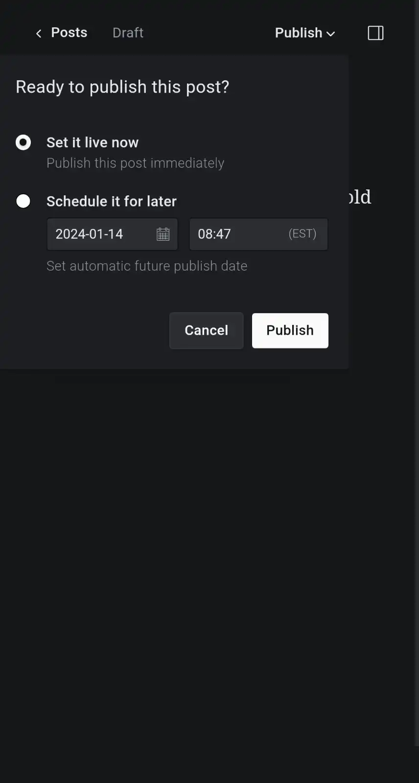
- Move/improve the UX of the Save/View/Publish buttons (maybe with a dropdown)
- Publish in the future could be moved to this dropdown
Examples
WordPress WYSIWYG Post Editor

Publish Dropdown Menu